Information Design - FLIP exercises
11/01/2023 - 02/02/2023 / Week 01 - 04
Bachelor of Design (Hons) in Creative Media
Information Design FLIP exercises
Information Design FLIP exercises
LECTURES
♡ FLIP classes / exercises are all conducted by Mr Shamsul & Mr Hafiz.
♡ Week 1 - Different types of Infographics
Mr shamsul started the class by explaining to us the types of infographics and giving us a brief overview of what the functions of infographics are. Then, we were seperated into our own groups to work on a presentation slides for the topic itself. After 30/40mins passed, Group 2 was chosen to present their slides to the class.
♡ Week 2 - L.A.T.C.H
Similar to Week 1, Mr Shamsul also ask us to seperate into our own groups to work on a presentation slides for L.A.T.C.H. After that, another group was chocen to present their slides to the class.
♡ Week 3 - Miller's Law Chunking
This week, Mr Hafiz was in charge of our lecture session and he started to explain to us about what is chunking. Then, he gave us time to work on our presentation slides for the topic. This time, another different group was also chosen to present their slides to the class.
INSTRUCTIONS
<iframe src="https://drive.google.com/file/d/1RpyqfqBPq2wbauIavtvTbo428Rfzo9Nq/preview" width="640" height="480" allow="autoplay"></iframe>
FLIP TASK 1 - WHAT IS INFOGRAPHIC? (GROUP)
♡ Find out the different types of infographic
♡ Work in groups and compiled all the data we've found
♡ Week 01, 11/01/2023
♡ We were told to work on flip task 1(finding different types of infographics) during the lecture session! Myself, konomi and joyee are in charge of creating the presentation slides for this topic. So after class we started working on it. Since we found a total of 12 different types of infographics, we decided that each of us will be compiling a total of 4 types into the slides.
<iframe src="https://drive.google.com/file/d/1ZaHd6i9FZOZeYzi-OXwZqYVYqomfCo61/preview" width="640" height="480" allow="autoplay"></iframe>
Fig1.2 What is infographics powerpoint slides
FLIP TASK 1 - REDESIGN INFOGRAPHIC (INDIVIDUAL)
♡ Choose 1 poorly designed infographic
♡ Redesign the infographic by using any online/ free infographic tool
♡ Show the before and after of the infographic as well as personal review & rating (difficulty, usefulness, design templates and choices).
♡ The online tool (platform) that I chose is Canva
PROGRESS ( WEEK 01 - 11/01/2023 ) :
♡ I started to look for a poorly designed infographic but it was a little difficult since 'poorly designed' is such a vague description but Mr Shamsul clarified by saying if the information presented is unclear then it's considered as poorly designed. Below shows the infographic I have found to redesign.
Resons why I chose this poster:
- The informations are all over the place and it took me a few minutes to fully understand what the infographic is about.
- Instead of a circular timeline infographic, it could'e been just a simple and straightforward one.
- Too many icons floating around the composition making it look messy and jumbled up(?)
- Some of the informations are in short forms and not everyone can understand it.
FIRST ATTEMPT :
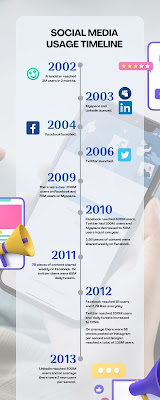
♡ After analysing, I started to work on the infographic. I decided to go with a simple and straightforward design, not to many logos but also using a few icons to showcase the keypoints in the information from each year. I also chose the colour blue as it reminds me of 'technology'.
♡ 2nd attempt, I wanted to design another one that looks more like a timeline infographic(?) :] This time I figured I could include the 'timeline' bar and positioned the informations in a left & right manner. I did not use much vectors/icons in this one as I did not want it to look overly crowded.
 |
| Fig 1.6 Infographic 2nd attempt |
PERSONAL RATING FOR CANVA:
Difficulty: 1/5☆
♡ I find Canva quite easy to navigate and use. The interface is also very clean and clear, with one glance users are able to understand what certain tools or functions are used for. It is also easy for users to search for vectors, images etc when working on their design as Canva has a built in library full of graphic elements for users to pick and choose from!
Usefulness: 4/5☆
♡ Canva is a perfect tool for those who wants to design without having to pay for adobe or for those who has no idea how to use adobe softwares. Personally, I find canva useful as there are tons of templates to choose from. There are also different categories of templates to choose from on the home page (see Fig 0.0)! Canva also has a sharing function which allows multiple users to collaborate on one design. This function is especially useful for students when designing presentation slides as everyone from the team can view and work on the presentation at the same!
 |
| Fig 2.1 Different categories on Canva |
♡ There is also a library full of graphic elements for users to choose from! It saves time as we don't have to go looking for what we want from other websites! Users can also upload their own images into Canva if they want to. There is also a tool where users can create their own text effects such as neon text, wavy text, etc.
Design templates and choices: 3.5/5☆
♡ Since Canva caters to a large audience, there are many templates available and a variety of different themes to choose from, as shown in Fig 0.0.
♡ However, some of the templates are only available for Canva Premium users which means users would have to pay for the premium membership to be able to unlock those features. Not to mention, non-premium users would have to make changes to some of the templates as selected ones may contain paid graphical elements (images, shapes, vectors, etc).
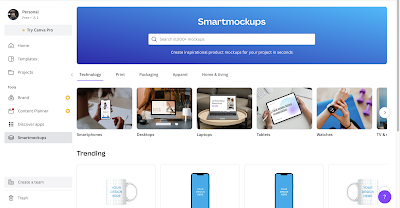
♡ This depends on each individual but I really like how Canva allows us to personalise our designs even when using a certain template! So users won't have to follow the colours or fonts that the template offers as they are able to change those elements into something they would prefer more! I also just realised this recently but Canva now offers smart mockups for premium and non premium users!
FINAL FLIP TASK 1 - REDESIGN INFOGRAPHIC (INDIVIDUAL)
FLIP TASK 2 - L.A.T.C.H THEORY
♡ L.A.T.C.H is short for location, alphabet, time, category and hierachy.
♡ Week 02, 19/01/2023
♡ Similar to the first flip task, myself, konomi and joyee are in charge of creating all the presentation slides for any tasks or exercises. So after our other group mates finished with their research, we started working on the powerpoint slides! We also divided the work load equally among ourselves.
<iframe src="https://drive.google.com/file/d/1diDugxtUiyrso92qT-jXuR9hu2bIbREY/preview" width="640" height="480" allow="autoplay"></iframe>
Fig3.2 L.A.T.C.H powerpoint slides
FLIP TASK 3 - MILLER'S LAW CHUNKING
 |
| Fig4.1 FLIP 3 task |
♡ Week 03, 26/01/2023
♡ After Mr Hafiz explained to us a littl about Miller's Law (Chunking), he then asked us to research on chunking and create presentation slides on the topic.
<iframe src="https://drive.google.com/file/d/1tottpzU09Hboaeb59cl6L6GczYM9zSMm/preview" width="640" height="480" allow="autoplay"></iframe>
Fig4.2 FLIP 3 powerpoint slides
FLIP TASK 4 - MANUEL LIMA'S 9 DIRECTIVE MANIFESTO
♡ Week 04, 02/02/2023
<iframe src="https://drive.google.com/file/d/1Mh-cHZYMWqQONOTkEJN5PpWGkzJ5rtcN/preview" width="640" height="480" allow="autoplay"></iframe>
Fig5.1 FLIP 4 powerpoint slides
REFLECTIONS :
It was interesting to learn that there as so many types of infographics and also the different ways to present informations on a infographic. The classes were quite interesting as we get to research the topics on our own and design presentation slides for it.


Comments
Post a Comment