♡ On the first session, Mr Asrizal and Mr Kannan briefed us on our MIB and our major project guidelines. After the briefing, we were told to prepare our ideas and present them next week.
consultation based classes
must finalise proposal by W3
will be asssigned under a supervisor after proposal is done
consultation time will be based on each supervisor's schedule
change of topic not advisable after W5
major project cannot feel like an assignment
can be a group project but will still be evaluated individually
Pathways for Major Project:
Look back at dissertation topic (see how it can be pursued into creative outcome)
Find an actual live brief, find a client to work with
(disclaimer: client has to be approved by teaching team)
Find any topic (start from scratch)
MUST have one or more:
What purpose, target audience, understand demographics
Who benefit from this
What problems are you solving?
eg: Blue Ocean strategy - create a new market that doesn't exist
WEEK 02 (30/04)
♡ I decided to propose a total of two ideas for my project. The first idea is about women's safety issue in Malaysia and the second idea is to raise awareness on the slowly 'forgotten' culture of Baba Nyonya among younger generations in Malaysia.
♡ Mr Asrizal mentioned that women's safety idea is good but there is just too many loopholes in making an app. He advised me to think of some other solutions to this issue.
♡ Initially, I came up with another solution for women's safety that is to create a brand that focuses on women's self defence items. There will also be a camapign to give out free self defence trial kits around train stations and universities to advocate for women’s safety in public. However, Mr Asrizal mentioned that there are so many self defence items out in the market so what makes mine different?
♡ I was advised to think if there are any other ways but at that point, I really couldn't think of any. Using the MRT women's coach as an example, even when there are clear signs that states the coach is for women's only, men still sit on the coach nonetheless so to me soley raising awareness to this issue is just not enough.
♡ After careful consideration, I decided to work back on my other idea which is Baba Nyonya culture. Mr Asrizal mentioned that I have to research and choose one specific area in Baba Nyonya to focus on since the culture as a whole is very wide.
♡ I went ahead and refined my proposal on the same week and sent to Mr Asrizal through MS Teams. Whenever we talk about Peranakan or Baba Nyonya in general, it's mostly about food and I wanted to do something different so I decided to focus on Peranakan Art culture as it's something that not many people are aware of. I was assigned to Ms Anis as my supervisor on 10/05/2024.
♡ This week, I consulted with Ms Anis and got her feedback on my idea. She mentioned that my idea is clear with straigthforward execution. I was told that the points made for my current issue is good but I have to find some research articles to backup my claims so that way my project can have a bigger purpose than just a card game.
♡ I started by finding a few research paper / articles to justify my current issues. After that I looked through multiple websites to get all the Peranakan Art artifacts and worked on the game principles of my game cards. I made a rough draft of how I wanted to categorise all my cards as well as the tier name for the cards. Lastly, I worked on my art direction & moodboard.
♡ Besides the rough project timeline I included in my proposal slide, I also decided to create a gantt chart on Google Sheet. This is for my own personal use to keep track of my weekly progression. (shown below is a rough draft of how my gantt chart looks like on this week).
♡ My idea was mainly inspired by Pokemon cards so I decided to buy a pack to look at their designs and the finishing of their cards. This made me think about what type of card and finishing I want to use for my trading cards! Having the cards up close is also easier to look at since some of the images of Pokemon cards online is either blurry or too small.
Pokemon cards!
WEEK 06 (28/05)
♡ Since I had 2 different art styles in mind, Ms Anis told me to try drafting both to see which one fits more. After trying both styles, I decided that going for the vector style is more suitable and also less time consuming for me to design compared to the watercolour style.
♡ With my art style decided, I can now work on my illustrations and the card design! Ms Anis also advised that I could start illustrating the easiest first and leave the hardest for last. I decided to illustrte the artifacts in Super Rare (SR) tier first because it has the least cards. Once I have my first asset done, I drafted the card layout as well as the backing. Deciding the layout first made my progress slightly easier behind since I can just replace the text and asset once all of my illustrations are done. (progression for all my illustrations will be compiled into a slides down below for easy reference)
DRAFT_card layout (1)
DRAFT_card layout (2)
♡ I also started my logo design. I wanted to go for a Nouveau style like my trading card name but I ended up taking inspiration from the Peranakan tiles since it reflected my project more.
Logo progression (1)
Logo progression (2)
FINAL_logo (colour)
WEEK 07 & 08 (04/06 - 11/06)
♡ I made a trip down to Melaka as we don't have classes on week 08 (ILW). I went there to take pictures of the artifacts that I will be illustrating so that I can accurately portray them.
Some images I took during my trip
♡ I used shapes to differentiate the different card tiers and Ms Anis suggested that I could use shapes seen in some Peranakan tiles. I took pictures of various tiles during my trip to Melaka so I just picked 3 different shapes for the different tiers.
Ammended backing cards based on different tiles
♡ Besides this, I continued to work on my illustrations. I wanted my tiles to have the 'tile' effect so I played around with 3D tool in Illustrator and Bevel / Emboss in Photostop to see which one looks more realistic and better!
Playing around with different effects
WEEK 09 & 10 (18/06 - 25/06)
♡ After the consulting with Ms Anis on week 09, I realised that some of my illustration lacks depth that's why some of them looked kinda flat. I went ahead and made the necessary ammendments to some of my artifacts and gave them a new look! (progression for all my illustrations will be compiled into a slides down below for easy reference) I also started my packaging design this week & test printed to see if the sizes are accurate!
Packaging measurements
Packaging design
Test print (b&w)
Test print (colour)
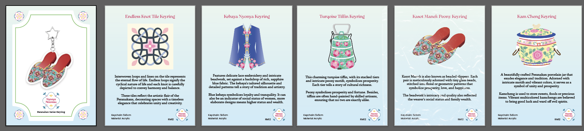
♡ As the illustrations I chose to print as keyrings were done, I proceeded to order the keyrings first so that I don't have to rush printing afterwards. I placed my order on 29/06 and the keyrings arrived to me on 04/07! I decided to go with 5x5cm acrylic keyring~
Keyrings
WEEK 11 (02/07)
♡ We were suddenly informed that we had a progression update presentation this week so I worked on the slides for this presentation. We had to include everything that we have so far and it is a 70% progression presentation.
♡ Initially, the idea was to have different background for the cards based on the flavour text but I realised that the background may draw the attention away from the artifacts.
Intial design for the cards
♡ After looking at different type of game cards, I was inspired by Love & Berry's fashion cards where they have sparkly / colourful overlays on the background. This way it still enhances the card design while still allowing players to focus on the artifacts!
Trying different overlays
♡ Colour for Rare tier has been ammended based on the feedback given by some of the supervisors during the progression presentation.
Testing different colours
WEEK 12 (09/07)
♡ I continued to work on my trading cards this week and I am already at 70% done :'D Before starting my project, I've already looked at a few printing shops to compare their prices and printing quality. I found one that is able to print my trading card size and their quality looks good too! As most of my illustrations are done, I decided to test print my postcards, stickers, and a few trading cards to see the outcome of my colours and the paper quality.
Test print outcome
♡ I had to design backing cards for my keychains as well as my stickers since I opted for die cut stickers. Both backing cards will have front and back side.
Keychain backing card (front & back)
♡ For my sticker pack, I decided to include a pantun on the back of the backing card. I translated the pantun from Malay to English for people to understand more easily.
Sticker pack (front & back)
Top part of sticker pack
WEEK 13 & 14 (16/07 - 23/07)
♡ Since my project is a trading card game, I wanted to design something where people can store their trading cards. It was either a binder or a collect book. I went with collect book as it is smaller, portable and easier to store! For those wondering what is a collect book, it's basically like a photo album but made for trading cards / photo cards! This trend started from Korea and it's mainly popular among the K-pop community but it is slowly becoming more popular amongst the trading card community.
Collect Book design
♡ I also designed a tin case where players can also use to store their cards or some of our other merchandise like keychains and stickers. This trend came from Korea and China where people use it to store their stuff (inspired from the retro candy tin case).
DRAFT_tin case design
♡ I wanted to print some of the elements I designed on a foam board to display during the showcase but printing a foam board is kinda expensive :< so I decided to improvise! I bought black EVA foam and printed my elements on A3 paper using our uni's printer. This helped me saved on costs as EVA foam is cheap and printing is technically 'free' because we have printing money provided on our student id :D
Printing @ library
WEEK 15 & 16 (30/07 - 06/08)
♡ Our Final Year Showcase is on 09/08 - 11/08 so these two weeks I have been finalizing all my printing items and preparing the packaging that is need for some of my merchandise.
Changing the keychain clasp to stars ☆
♡ Since Ms Anis mentioned that the sparkle lamination I used wasn't shiny enough, I found another seller and this time I ordered 3 different types of sparkly laminations. Thankfully the laminations arrived on time so I tested them out on my cards. The final decision was to use the left lamination for Super Rare tier and right lamination for Rare tier.
Testing different laminations
♡ Since Super Rare tier must be the most sparkly, I decided to use the left one for SR and right one for Rare tier! Moving on, poster and website was a last minute addition after week 11 so once I was done with my trading card design, printing and other applications, I started to work on it asap!
DRAFT_poster design
♡ As usual, I went with Adobe XD for my website. Eventhough Adobe has 'given up' on providing XD new updates starting this year, I still find it easier to use than Figma. I do admit that there are limitations to Adobe XD but my website doesn't include any complicated UI so I felt that using XD is sufficient.
Website progression
♡ Lastly, I also deisgned a simple QR standee to display on my table for the showcase to let people scan! One side is for Nyonya Nouveau's website and another is my personal Linktree :D I even printed this myself to save on budget!
Embarking on this final year project has been an incredibly fulfilling experience that has shaped both my creative and academic journey. This project has provided me with a unique opportunity to fuse my passion for design, storytelling, and cultural preservation into a cohesive and meaningful work. I wanted a project that not only showcased my skills but also made a significant contribution to the appreciation and preservation of cultural heritage. My inspiration came from Peranakan culture as I am someone who is exposed to this culture since young (born & raised in Penang). Morever, my grandma (mother’s side) is a Baba Nyonya.
One of the key challenges I faced during this project was the need to balance multiple aspects such as creating a visually appealing and engaging trading card game, ensuring the educational content was accurate and meaningful, and integrating a compelling narrative that would resonate with players. This required extensive research into Peranakan art, history, and traditions. The process was demanding, but it also pushed me to refine my skills in research, design, and project management.
As I reflect on my journey, I am proud of how Nyonya Nouveau has evolved from an initial concept into a fully realized product. The inclusion of additional merchandise, such as stickers, keychains, and postcards, was an intentional decision to extend the impact of the project beyond the game itself. These items serve as tangible reminders of the beauty of Peranakan art and provide another avenue for cultural engagement. Every detail on the cards and the stories was crafted with respect for the Peranakan culture. Attention to detail not only enhanced the authenticity of the project but also deepened my appreciation for the meticulous craftsmanship that goes into preserving cultural heritage.
In conclusion, this project has been a personal and professional journey of growth. I have learned to navigate the complexities of cultural representation, the intricacies of game design, and the demands of managing a comprehensive project from start to finish. The skills and insights I have gained will undoubtedly shape my future endeavors.


Comments
Post a Comment