Brand Corporate Identity - Task 04
Bachelor of Design (Hons) in Creative Media
Brand Corporate Identity Task 04
Brand Corporate Identity Task 04
LECTURES
♡ All lectures and recordings completed in
INSTRUCTIONS
<iframe src="https://drive.google.com/file/d/1asc8NuuIIDdR4O_vDHfR9UsB5mrqkcGA/preview" width="640" height="480" allow="autoplay"></iframe>
TASK 4
♡ This task is a collaboration project with our Brand Corporate Identity module. We are to come out with out brand guidelines for this task
♡ Document size - 1366 x 768px, single document per page, no facing pages
♡ A Brand guideline is different from a corporate identity system, it is much more simpler than Corporate Identity System.
Things to include:
- 1st chapter, profile of our brand (brand positioning etc)
- 2nd chapter, everything to do with logo
- 3rd chapter, how we apply our brand identity to various applications
- 2nd chapter, everything to do with logo
- 3rd chapter, how we apply our brand identity to various applications
PROGRESS ( WEEK 9 - 27/10/2022 ) :
♡ I started by looking at a few references of other company's brand guidelines.
 |
| Fig 1.3 Reference 3, source |
DETERMINING GRIDS:
♡ Determine how we will be using the grid system. We were told to come up with a total of 2 different grids to see which one we like best.
<iframe src="https://drive.google.com/file/d/1um6OAUhEs48IRkh2XM5Td-mYNBt5nzwp/preview" width="640" height="480" allow="autoplay"></iframe>
Fig 2.1 Determining grids
LAYOUT PROGRESS ( WEEK 9 - WEEK 12 ) :
♡ Based on the grid systems above, we were then told to create 2 different layouts using the 2 different grid systems. My final chosen grid system is the 2nd one with 7 columns.
♡ After settling with our prefered grid system, we were then asked to design the coloured version, from first page till the end of first chapter.
♡ After the feedback session, I decided to retry my layout as well as the navigation bar.
<iframe src="https://drive.google.com/file/d/1Il4bnNOnD7pULxgyTzeqbMFrY2fcnqz_/preview" width="640" height="480" allow="autoplay"></iframe>
Fig 2.6 Brand guideline attempt 2
♡ During the feedback session, both Ms Lilian and Mr Vinod mentioned about my colours being too pastel so I decided to introduce new colours to my palette.
♡ For Visual guidelines, I was advised not to use images from my collaterals. Ms Lilian suggested that I could use my patterns to showcase the 'texture' & 'feel' since it falls under the 'identity' section.
 |
| Fig 2.9 Initial collateral image used (1) |
 |
| Fig 2.10 Initial collateral image used (2) |
 |
| Fig 2.11 NEW patterns used |
 |
| Fig 2.12 NEW image used |
NAVIGATION BAR PROGRESS:
♡ Personally, I struggled alot with the navigation bar. We were told to try something unique instead of the simple navigation bar. Making the navigation bar into a circle form was a unique idea at first but a few of my classmates started making their navigation bar into a circle form so it became normal too. Below are a few youtube videos I've watched to get familiar with the interactive buttons.
♡ Aside from the simple navigation bar that shows up on the top or side, I decided to try this layout where I fit all of my navigations into 1 box. Mr Vinod mentioned it looks like the navigations from government page so I decided to retry.
♡ I decided to make my navigation bar into a heart shape as my brand is called 'Lovebomb' so the heart is derrived from 'love'. I was quite satisfied with this version so I decided to go with it. While trying to link my pages together, only 'home' button and 'visual guidelines' was clickable since all my text are overlapping with each other.
♡ I figured I had to create outlines for all of my texts before converting them to buttons. After doing that, all the buttons are clickable since none of the texts are overlapping. I was also advised to change the 'home' button to 'content'.
♡ Another issue I had while creating navigations was my buttons not showing up correctly in Google Chrome. It shows up fine in my Indesign file as well as the preview function in Indesign so I'm not sure what went wrong. (Still could not find the solution to this)
Navigation walkthrough:
♡ Left right buttons (heart and bomb mascot) on top left of every page, can be brought to next page once pressed. The brand logo is also clickable and it will take users to the next page.
♡ Navigation button on top right of every single page, when roll over it changes to light pink and once click it changes to hot pink. If click it will bring user to the destination.
 |
| Fig 3.6 navigation button |
♡ Headings (01, 02 and 03) are buttons, changes to a purple colour once clicked and hot pink when rolled over, will also bring users to its' specific destination.
 |
| Fig 3.7 table of contents, 01, 02, 03 title are clickable |
♡ Texts are buttons on these pages shown below, changes to blue colour once clicked and hot pink when rolled over, will also bring users to its' specific destination.
 |
| Fig 3.8 about us, all subheadings are clickable |
 |
| Fig 3.9 visual guidelines, all subheadings are clickable |
 |
| Fig 3.10 applications, all subheadings are clickable |
♡ Texts are buttons on these pages shown below, changes to original colour once clicked and hot pink when rolled over, will also bring users to its' specific destination.
 |
| Fig 3.11 stationery, all texts inside the circle are clickable |
 |
| Fig 3.12 merchandise, all texts inside the circle are clickable |
 |
| Fig 3.13 communication, all texts inside the circle are clickable |
 |
| Fig 3.14 environment, all texts inside the circle are clickable |
♡ Pop up window (1), click on image the pop up window will appear.
 |
| Fig 3.15 pop up window (1) |
♡ Pop up window (2), click on 'target audience' the pop up window will appear, and by clicking on the 3 illustrations on the left, the other texts will appear too.
 |
| Fig 3.16 pop up window (2) |
 |
| Fig 3.17 text appearing when clicking on the illustration |
♡ Roll over (1), logo will change from black and white to coloured version when rolled over.
♡ Roll over (2), patterns will change colours when rolled over.
 |
| Fig 3.19 roll over (2) |
FLIPBOOK ERROR:
♡ Initially when I uploaded my interactive pdf on the flipbook website, it was weird how all of my interactive buttons were missing. Then I realised I had to upload a pdf version that is not interactive for everything to show up nicely on the flipbook. Luckily I seperated my layout and navigation files so it was easier for me to export them seperately without having to redo anything.
FINAL TASK 4
♡ For optimal viewing (and for all the buttons to be working), it is best to open the pdf using Google Chrome. Sometimes, some of the elements will dissapear if it's opened with Safari, Preview, etc.
 |
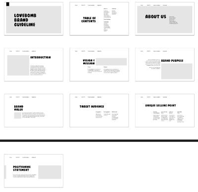
| Fig 4.1 FINAL brand guideline thumbnail, JPG |
 |
| Fig 4.2 FINAL brand guideline thumbnail, JPG |
 |
| Fig 4.3 FINAL brand guideline thumbnail, JPG |
 |
| Fig 4.4 FINAL brand guideline thumbnail, JPG |
 |
| Fig 4.5 FINAL brand guideline thumbnail, JPG |
 |
| Fig 4.6 FINAL brand guideline thumbnail, JPG |
 |
| Fig 4.7 FINAL brand guideline thumbnail, JPG |
 |
| Fig 4.8 FINAL brand guideline thumbnail, JPG |
<iframe src="https://drive.google.com/file/d/1-_HReLr7PT7F8IggF2HqAmP655YStJ1W/preview" width="640" height="480" allow="autoplay"></iframe>
Fig 5.1 FINAL brand guideline thumbnail, PDF
<iframe src="https://drive.google.com/file/d/14JeFUyB72KCnSzguth1XeGi4NNvrbjc5/preview" width="640" height="480" allow="autoplay"></iframe>
Fig 5.2 FINAL brand guideline, PDF
Fig 5.3 FINAL brand guideline walkthrough video
♡ Flipbook for viewing purposes only. Interactive buttons does not work in flipbook.
Fig 5.4 FINAL brand guideline flipbook
 |
| 4th page - about us |
 |
| 5th page - welcome page |
 |
| 6th page - tagline + image |
 |
| 7th page - vision & mission |
 |
| 11th page - target Audience |
 |
| 12th page - USP |
 |
| 13th page - positioning statement |
 |
| 14th page |
 |
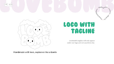
| 17th page - logo variations |
 |
| 19th page - logo clearspace |
 |
| 20th page - logo space rationalisation |
 |
| 21st page |
 |
| 22nd page - logo minimum size |
 |
| 23rd page - logo appearance |
 |
| 24th page - improper usage |
 |
| 25th page - logo colour |
 |
| 26th page - brand colour |
 |
| 27th page |
 |
| 28th page - headline typography |
 |
| 29th page - body text typography |
 |
| 30th page - tagline typography |
 |
| 31st page - patterns (1) |
 |
| 32nd page - patterns (2) |
 |
| 33rd page |
 |
| 34th page - applications |
 |
| 35th page -stationery |
 |
| 36th page - stationery flatlay |
 |
| 37th page - business card |
 |
| 38th page - brand business card |
 |
| 39th page - founder business card |
 |
| 40th page - co-founder business card |
 |
| 41st page |
 |
| 42nd page - letterhead |
 |
| 43rd page - letterhead |
 |
| 44th page - continuation sheet |
 |
| 45th page - continuation sheet |
 |
| 46th page - envelope |
 |
| 47th page - envelope |
 |
| 48th page - invoice |
 |
| 49th page - invoice |
 |
| 50th page - merchandise |
 |
| 51st page - TQ card |
 |
| 52nd page - TQ card |
 |
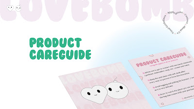
| 53rd page - product careguide |
 |
| 54th page - product careguide |
 |
| 55th page - sticker flakes |
 |
| 56th page - sticker flakes |
 |
| 57th page - packaging paper |
 |
| 58th page - communication |
 |
| 59th page - website |
 |
| 60th page - website |
 |
| 61st page - app |
 |
| 62nd page - app |
 |
| 63rd page - social media |
 |
| 64th page - social media (2) |
 |
| 65th page - social media (3) |
FEEDBACKS
Week 11 - 08/10/2022
Lecturer Feedback:
- Remove the bar because it does not align with my brand
- Overall layout information looks fine
- I can try to use my wordmark as the ‘bar’ instead to see how it works and my navigation bar can be on the left or right top
- I can also try to change my navigation bar on the side instead
- Maybe my logo can appear in the center white the other navigation informations can be on the side of the logo
- Or I could use my element as a navigation icon and when people hover it the text will appear
Week 12 - 15/11/2022
Lecturer Feedback:
- colours look more contrasting
- for 'vision & mission' page just put the text under the title instead of repeating it in the paragraph.
- instead of using images from my collaterals in the visual applications, I could perhaps introduce patterns there instead to showcase the 'feel & texture' of my brand. It also fit well with the section.
- for brand colour, I can just put the hex code inside the little hearts instead of repeating it.
- I can also include a link to my brand's instagram page on the last page.
- overall looks pretty good to go
REFLECTIONS :
Experience -
I was glad to hear that this task is a combined task with Publishing design and Brand Corporate Identity. It really made our workload much less. I am also glad that the informations needed and included for this task were already done previously so all we had to do is just determine a layout and figure out the navigation bar. Overall, it was quite manageable to carry out this task as this was almost the end of the semester. The only hectic week we had was week 11 where Mr Vinod suddenly wanted us to complete the FULL layout and all navigations all-together. Another stressful part was that we had to come up with a unique navigational system which no matter how much I think about it, I still couldn't come up with one (and that is my problem to fix). Nonetheless, I was quite happy to see how my brand guideline turn out and I'm very satisfied with my own work.
Observations -
I observed that creating a good navigation system is not easy. Linking pages to buttons is also not an easy task as sometimes we might not know what would go wrong. I learnt that it would be the best option if we seperated our layout and navigation files to avoid any issues from happening. We can test if our buttons are working in the navigations file without having to redo anything if it goes wrong.
Findings -
I found that creating a brand guideline may look simple however that is just not the case. It takes many trials and errors to be able to come up with a consistent layout with good flow. I also learnt that to create a brand guideline, you must have a deep understanding on the brand itself. With proper knowledge of the brand, we will be able to reflect it on the guideline itself.
FURTHER READINGS :
A brand guide is how an organisation (brand or company) presents itself to the world through its logo, font, colour selection, photography and many more. A brand guideline is important as it is how the world recognises your brand and begins to trust your brand.
Key components of a brand identity:
- Vision & Mision
- Target Audience
- Brand Personality
- Core Values


Comments
Post a Comment