Brand Corporate Identity - Task 03
Bachelor of Design (Hons) in Creative Media
Brand Corporate Identity Task 03
Brand Corporate Identity Task 03
LECTURES
♡ All lectures and recordings completed in
INSTRUCTIONS
<iframe src="https://drive.google.com/file/d/1asc8NuuIIDdR4O_vDHfR9UsB5mrqkcGA/preview" width="640" height="480" allow="autoplay"></iframe>
TASK 3A BRAND POSITINING & IDENTITY
♡ In this task we are going to consider the positioning and identity for our logo & brand, rationalise and create brand positioning. The whole brand positioning will be done in slides
Requirements
- Create moodboard, colour visual and typograph
- Design relevant applications
- Logo applications (business card, letterhead, continuation sheet, envelope and invoice)
- 4 collateral depending on our brand
- Digital presence (website - landing page, UI and socmed)
- Environmental graphics & simulations
♡ I started to search around for visual references first before starting the slides. After getting the visual references done, I began to layout my slides in Illustrator. Unfortunately, Canva does not have the typeface that I have selected for my brand so that is why I chose to design my slides in Illustrator.
♡ During the feedback session, Ms Lilian mentioned that I have to seperate my visual references into categories so that was what I did next. Then, I started to finalise my brand positioning slides.
FINAL TASK 3A
<iframe src="https://drive.google.com/file/d/1xd0AUTAHIhTZRzz2ZxnCW3SmMgzMCCbM/preview" width="640" height="480" allow="autoplay"></iframe>
Fig 2.1 FINAL Brand positioning slides
TASK 3B APPLICATIONS
♡ After completing the slides, I began to work on the corporate stationeries and collaterals. The colours used in my designs are mainly the secondary colours I proposed previously. I also decided to use some of my patterns as design elements. *All of the attempts shown below are done during our ILW (Week 8)*
PROGRESS ( WEEK 9 - 25/10/2022 ) :
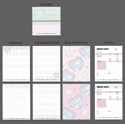
♡ I started making all the necessary changes and adjustments after recieving feedback from Ms Lilian. Ms Lilian suggested I could create 2 seperate design direction for my stationeries and collaterals. The direction of my stationery will be playing with my wordmark(mostly) and the difference in their opacity whilst for my collaterals it will be a more playful vibe using parts of my logo as patterns.
♡ I actually forgot to design the envelope on Week 8 so I started to work on it as soon as I had the time to (manage to finish before W9).
 |
| Fig 4.2 Corporate stationery progress (2) |
 |
| Fig 4.5 Website progress (2) |
♡ Following Ms Lilian's suggestion, I decided to create an app for my digital presence. Since Lovebomb is already an existing online store, I did not have to recreate the social media aspect (Instagram) for it. I was told that I could just screenshot my actual Instagram page hence that is why I made the decision to create an app.
 |
| Fig 4.6 App progress (1) |
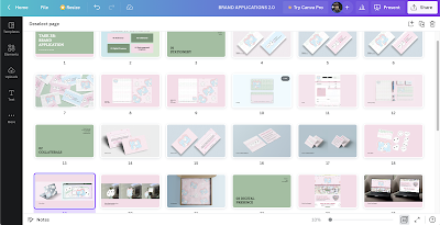
♡ Last but not least, I also started to work on this task's final submission slides. I created a layout first and added the necessary informations in so when it's almost time for submission I can save some time and just upload my final designs into the slides.
PROGRESS ( WEEK 10 - 02/11/2022 ) :
♡ This week is mostly about finalising our designs as well as working with the mock ups for our items. There were many trial and errors for me when working with the mock ups as some of the sizes does not match. Some mockups also made my design looks darker which sucks (as shown in Fig 5.2) :')
 |
| Fig 5.1 Overview of my files |
 |
| Fig 5.2 Name card mockup (discarded because of lighting) |
♡ The initial mockup bag for my stickers is the one on the right. It has the 'grainy' effect but I did not like it so I decided to erase them and added plastic textures on my own to make it look more like a zip bag since I think it's lacking in that area.
 |
| Fig 5.3 Sticker pack mockup progress |
♡ Finalising my slides for submission!
 |
| Fig 5.4 Slide progression (2) |
FINAL TASK 3B (DIGITAL DESIGN + MOCK UP)
♡ Stationeries
 |
| Fig 6.1 FINAL name card (business) |
 |
| Fig 6.2 FINAL name card (founder) |
 |
| Fig 6.3 FINAL name card (co-founder) |
 |
| Fig 6.4 FINAL name card (flat lay) |
 |
| Fig 6.5 FINAL letterhead |
 |
| Fig 6.6 FINAL continuation sheet |
 |
| Fig 6.7 FINAL invoice |
♡ Collaterals
 |
| Fig 7.4 FINAL product careguide (front) |
 |
| Fig 7.6 FINAL sticker flakes |
 |
| Fig 7.7 FINAL sticker flakes on laptop |
 |
| Fig 7.8 FINAL sticker flakes on window (1) |
 |
| Fig 7.9 FINAL sticker flakes on window (2) |
 |
| Fig 7.10 FINAL sticker flakes on window (3) |
 |
| Fig 7.11 FINAL packaging paper |
♡ Digital presence
 |
| Fig 8.4 FINAL instagram (1) |
 |
| Fig 8.5 FINAL instagram (2) |
 |
| Fig 8.6 FINAL instagram flatlay |
 |
| Fig 8.7 FINAL digital presence overview |
FINAL TASK 3B (SLIDES SUBMISSION)
<iframe src="https://drive.google.com/file/d/11WFA92fLHS_J8ofwzvjPzZ0SRioFNOVB/preview" width="640" height="480" allow="autoplay"></iframe>
Fig 9.5 FINAL TASK 3B SLIDES SUBMISSION, PDF
FEEDBACKS
Week 07 - 11/10/2022
Lecturer Feedback:
- My product careguide and thank you card will be part of my collateral
- The 4 collaterals that I chose is quite easy to be done so Ms Lilian suggested me to create stickers as part of my collateral or I can add another 1 or 2 ideas
- I can design my invoice in a ticket format but it has to relate to my brand. Eg: how does the ticket represent my brand
- In visual references I can mention what I’m looking for in each picture like the vibe, the colour, etc
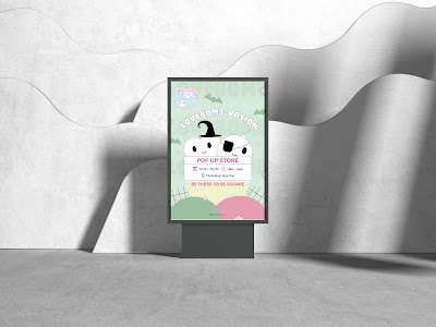
- For environmental graphics, since I don’t have a physical store I can create posters to advertise my service or envision how my brand would look like at a pop up store, etc. Have at least 2 ideas for this, it can also be a banner or billboard
- For UIUX I can use existing product pics that I already have
- Brand vision is something that is in the future. The ultimate goal of the brand.
- Brand mission is what the brand does on a daily to achive that goal (vision).
- I can seperate my brand introduction into 2 slides. 1st slide will be about lovebomb and the services I will provide and the 2nd slide will talk about the brand story (Started in what year, by who, etc) I can even include my brand rationale, why I named it lovebomb
- For USP - it could be about how we provide delivery service to remove carbon footprint
- Brand positioning statement states what the business is, who is it for, how is it unique from others
- I can remove the ‘style’ from my slides if I feel like I don’t have enough references to fit in
Find more visual references and finish my positioning statement before I start designing
Week 09 - 25/10/2022
Lecturer Feedback:
T3A - BRAND PROFILE
- Everything looks fine and good to go
- For my positioning statement its okay since my target audience is also very general
I would have to
T3B - DESIGN APPLICATIONS
(BUSINESS CARD)
- Take note of the leading for my informations in the name card as one looks a little more seperated than the others
- I can have a name card that is for the business and one that is for the owner, it can be the same design and different colours
- Ms Lilian picked my 2nd attempt as it looks very understated and it does not look like I am repeating my brand logo too much
- Have something busier on the front of the card to counter the back for looking empty
- Remove the bars as it makes my brand look very stiff when in fact my brand is supposed to be friendly and fun
- Take away the bar to see the possibilities
(INVOICE/LETTERHEAD/CONT SHEET)
(INVOICE/LETTERHEAD/CONT SHEET)
- Logo with opacity lowered down in my letterhead looks quite nice
- Go with the 1st choice for the back of my letterhead but shrink the size of my patterns to show more of my logo
- For the inside of my letterhead, I can look back at my name card and adapt the same style to it
- Use the idea of the wordmark ‘lovebomb’ and make it run through the entire page while playing with the opacity. If I want to introduce my mascots I can introduce them on the bottom of my letterhead together with the company information
- The top of the letterhead must include my logo, remove the bar as it is not helping
- Continuation sheet can be a similar design of the letterhead
- I can maintain the bar in my invoice as it is needed to indicate the title, amount, etc.
- Type size is too big for invoice, reduce the size
- Give more space to let my brand logo to appear and don’t be afraid of white space
- White space is important in this case (corporate stationery) as people need to understand the hierachy of information
- After finishing the other components, I can try to put them together and see how it looks like before I start designing my envelope
- Remember to leave a space to write address on the front of my envelope
(COLLATERALS)
- The design for name card without the bar looks more interesting and cohesive with my brand identity
- The front of my name card is actually fine but I still need to include my brand logo instead of my mascots only
- Too many typeface or components will ruin the whole desig
- Serif typeface is enough for my thank you card and product care guide
- Since I seem to be using mainly 2 ideas (one with wordmark all over the design and one with loose patterns of my logo) I can use either of them to differentiate between corporate stationeries and collaterals. One can be the forefront identiy.
- Do a mock up for my packaging paper to show how it is going to look like
- Create a sticker pack instead of one sticker for my last collateral (A5 size, die-cut sticker with white border)
(WEBSITE/UIUX)
- I can add thematic on my webiste
- My brand logo still needs to be included in my landing page, it can be right in the center of my landing page and then when I scroll down it will showcase my latest collection
- Bottom can also include contact info
- I can screenshot the 9 grid from my actual Instagram and use it as part of my UIUX, mock it up to show people how it looks like on phone
- Not neccessary to create an app but if I have time and I can manage, I can try to do so because this task is all about showcasing how the brand identity is applied on various applications
(ENVIRONMENTAL GRAPHICS)
(ENVIRONMENTAL GRAPHICS)
- Poster will be one of my idea
- I can either look for photographs of pop uop stores that I can adapt with my brand, change the panel colour, etc. Or I can create a banner advertising my brand
Week 10 - 01/11/2022
Lecturer Feedback:
- Change the patterns to a pink with lower down opacity rather than using the ones with white outlines
- For the designs with the gradient effect, the opacity can still be toned down slightly more to make our logo stand out, especially the green colour
- Put in another layer to help to mute the background
- Go with the simple design for the back of the name card
- Icons in my stationery can be in the pink shade I used for my name card
- Reduce the size of my mascots in my website since it's a little too eye catching and it makes users unsure of where to look first.
- App looks very cute
- Use both of the environmental graphics posters, for the christmas one go with the stockings.
- If I want to see, just make the view on illustrator into b&w then I can see how the colours compliments each other
- Shrink the elements and duplicate them in my packaging paper
- Patterns are used to enhance identity so we don't want them to be too outstanding (don't want them to be too significant)
- The 'cart' word in my app design is a little too big compared to my search bar, look back at my point size and maybe reduce it or make the search bar a similar size
REFLECTIONS :
Experience - Overall, I had much fun doing this task although it was very hectic since there were many modules going on at the same time. Thankfully, Ms Lilian decided to extend the deadline so I was able to manage to finish everything in time. It was very refreshing to see a brand that I have established on my own slowly start to have its' own visual identity.
Observations - I observed that having a clear direction or something to refer to (mind map) can be very helpful at times for this task as it acts as a 'guidance' for us when we are lost or out of ideas. I also observed that white space is very important in design. White spaces does not neccesarily mean bad, its actually good to utilise it to make the design more comfortable to the eye.
Findings - I found that it was fairly hard to find a good mock up that is able to compliment with my brand or designs. More often than not, the sizes of the mock up does not fit with my brand or the lighting and shadows does not give justice to my designs. I had to personally re-colour or re-adjust the sizes and lighting of the mockup. I think that finding a good mockup is even harder than designing at this point... :(
FURTHER READING:
This website is talking about brand positioning and how to build a winning strategy. Things to note are:
- identify target audience and understand their likes or dislikes
- provide clarity to consumers
- differentiate your brand with others (how is YOUR brand different?)


.png)


Comments
Post a Comment