Advanced Typography Task 02 - Key Artwork and Collateral

06/05/2022 - 27/05/2022 / Week 05 - 08
Ellyn Saw Mei Hui / 0353358
Bachelor of Designs (Hons) in Creative Media
Advanced Typography Task 02
LECTURES
All lectures and recordings completed in AdTypo_Task 01 - Exercise 01 & 02
♡ 06.05.2022 Week 06
(Hari Raya) No lecture this week but we still had our Ad Typo assignment to complete.
♡ 13.05.2022 Week 07
Mr Vinod started off the class by going through everyone's Task 2A - key artwork. There was a short break after the feedback session. Then, Mr Vinod started briefing us on our 2nd task which is Task 2B.
♡ 20.05.2022 Week 08
No classes this week, Independent Learning Week.
♡ 27.05.2022 Week 09
As usual, Mr Vinod started the class by going through everyone's work and giving his feedback. After that, he briefed us on our final task for Advanced Typography. He showed us various examples of what we can do and also told us to rewatch Monday's class recording on 2h 08 for a more detailed explanation of our final task.
INSTRUCTIONS
<iframe src="https://drive.google.com/file/d/17VaIOdq3wHU7TwoEiPXCyTZDDFDKcqzF/preview" width="640" height="480" allow="autoplay"></iframe>
TASK 2A: KEY ARTWORK
♡ To design a key artwork using our own name/ initials that behave as a logo and artwork will also be subsequently used for Task 2B on various collaterals.
♡ Choose an occupation which we might be interested in if we were not studying design.
♡ Only design on Illustrator and design in black and white first
♡ Artboard size : 1024x1024 or 2048x2048
IDEATION & SKETCHES :
♡ All images are sourced from Pinterest
♡ Occupation: Jewellery Store OR Florist, reason for choosing a jewellery store is because I personally have a small business that sells custom-made bead accessories. As for florists, my mom used to be one so I think I would follow in her footsteps if I wasn't studying to become a designer (and also because I really like flowers).
I began looking on Pinterest for images to use as references and also get some inspiration. For this task, I want my key artwork to look elegant and with that in mind, I started to dive deeper into the world of (mostly) monograms. I also prefer to design serifs in this case as it felt more appropriate for the chosen occupation.
 |
| Fig1.1 mood board for logo |
♡ After looking for inspiration, I started sketching my crucial artwork. At first, I started drawing with my initials E, S then I started exploring E, S and M + H altogether.
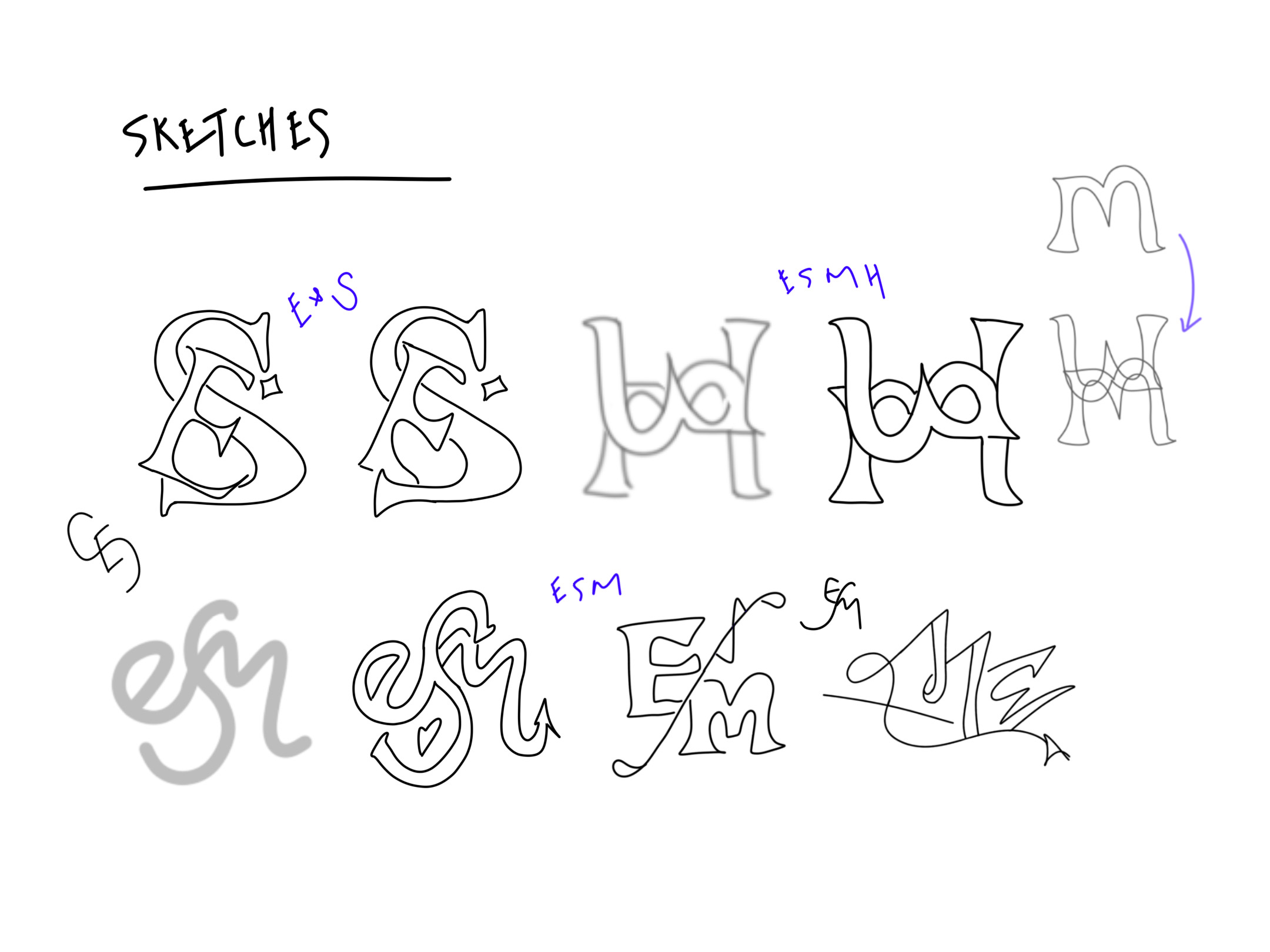 |
| Fig1.2 My sketches |
PROGRESS ( 01 - 02/05/2022 ) :
♡ First digitisation, total time spent 24 hours (including the time spent trying to look for ideas and sketching)Starting with my failed attempt. I went with my initials E, S, and M. I tried to warp the letters for it to become a little curvier and wavy to give off the "magical mystical/ Aladin" vibes to represent jewellery. This wasn't my proudest one so I decided to discard this idea but kept it here since it is also part of my progress.
 |
| Fig 1.3 attempt 1 & 2 |
For my 3rd attempt, I decided to go for a more straightforward and simple design using my initials E and S. I added a small sparkle element to represent the "bling" in jewellery.
 |
| Fig 1.4 attempt 3 |
As for my 4th attempt, I combine all of my initials (ESMH) together. I have to admit that this was one of my proudest ones as I personally felt like this would be suitable for a jewellery store. (however it really looks like there's only 1 initial in here) It radiates the "magical" vibe I was trying to go for. Ultimately among all the attempts, this one took me the longest to complete as I was trying to figure out how to make them all well balanced.
 |
| Fig 1.5 attempt 4 |
♡ Fig 1.5 (left) is the digitisation of my skecth before refining. Fig 1.5 (right) shows the breakdown of my logo, and how I tied E, S, M and H together into one.
 |
| Fig 1.6 sketch & logo breakdown |
SECOND ATTEMPT ( 16 /05/2022 ) :
♡ Total time spent, 12 hours
♡ After the feedback session on Week 7(13/5), I decided to discard all of my ideas and try again
This time I decided to go with the occupation of a florist. After my previous attempts, I learnt that combining all my initials would make or break the key artwork. So I decided to only use my initials E and S to make my key artwork simple and clean.
 | ||
|
I really like how attempt 5 (Fig1.7) turned out but I still wanted to explore how my key artwork would look like if the strokes were tinner so I decided to design another 2 more key artworks.
 |
| Fig1.8 attempt 6 & 7 |
The difference between this attempt and attempt 5 (Fig1.7) is in the letter "S". As seen in the image provided below, I added a small rectangular shape to clearly show that my letter used is "S". Another difference is between attempts 6 and 7. I wanted to make it clear that the other letter is "E" so I added another rectangular element acting as the midpoint of "E". On attempt 6 (Fig1.9 left) I drew something that looks like a leaf and on attempt 7 (Fig1.9 right) I used the shape tool to create a rectangle.
 |
| Fig1.9 details of attempt 6 & 7 |
After attempts 6 and 7, I realised that I still prefer the S wider and thicker hence I decided to go back to my original attempt (Fig1.7). I also felt like the elements used in attempts 6 & 7 did not really connect with my theme so I decided to change it into a tulip acting as the midpoint of my letter "E". With the tulip in place, the space inside still felt empty (negative space) so I decided to add another flower element to balance out the logo.
 |
| Fig1.10 attempt 8 |
 |
| Fig1.11 key artwork progress |
I started to explore what colours I will be using for my key artwork (coloured version) after the black and white version has been finalised. I tried to look for a more spring themed colour palette. The final colours decided here will then be used in my poster, collateral and also animated intro.
* Second colour palette from @/awsmcolor on Instagram *
 |
| Fig 1.12 colour testing for key artwork |
FINAL SUBMISSION :
 |
| Fig1.13 FINAL key artwork JPEG |
 |
| Fig1.14 FINAL key artwork (coloured) JPEG |
 |
| Fig1.15 FINAL key artwork simulation JPEG |
<iframe src="https://drive.google.com/file/d/1WqDxYMMdd9ZIkdYeL5WwShk7xm7qmaXB/preview" width="640" height="480" allow="autoplay"></iframe>
Fig1.16 FINAL Task 2A_PDF
TASK 2B: COLLATERAL DESIGN :
♡ Apply task 2A's key artwork in a poster, animated intro and any selected 1 collateral of our choice
♡ Total time spent, 48 hours (including amendments, different attempts, etc.)
POSTER DESIGN (A3) :
♡ All images are sourced from Pinterest
 |
| Fig2.1 mood board for poster & collateral |
Continuing, my idea was to make the "S" in my key artwork the main element of this poster design. Since this is a flower exhibition, I included all the important details such as the exhibition name, date, time, year and website link. (not forgetting my logo too) Then I added 2 more flower elements to represent the flower exhibition.
 |
| Fig2.2 attempt 1 |
While trying different ways to place the texts, I thought this way of placing the year would be good as it fits perfectly into the space however after looking at it a few more times the year "2023" looked like the dates instead. I was afraid it might confuse people since "13&14" was so close to the year so I decided to discard this idea and try another layout.
 |
| Fig2.3 issue faced |
Decided to change colours after my 1st poster attempt (Fig2.2) as I felt like the red might look like blood (my first thought after finishing the attempt.. I swear it looks better in my head). With the pink background combined with the big red "S", it really looked like a menstrual cycle ad.
 |
| Fig2.4 poster attempt 2 & 3 |
After several attempts, I still felt like my poster was lacking the "spring" vibe so I created something with a different layout. This time I decided to use more colours from the colour palette I chose and also went with a modular concept for my poster. At first, I thought of adding just the flower elements from my key artwork to fill up the blue box but it still look somewhat empty.
 |
| Fig2.5 attempt 4 & 5 |
Frankly, I had a hard time choosing which font (Arial MT round and Times New Roman) to use for the exhibition slogan as both fitted with the concept.
 |
| Fig2.6 progress for poster |
Ultimately I went with the Arial MT round. The poster still felt lacking and unbalanced so I decided to add the exhibition time (Fig2.7, 2.8attempts 6&7) to fill up the spaces in the first box.
 |
| Fig2.7 poster attempt 6 |
 |
| Fig2.8 poster attempt 7 |
AMENDMENTS ( 28/05/2022 ) :
♡ I really liked how my attempt 6 (Fig2.7) turned out so I decided to go with that poster.
♡ changes were made according to the feedback Mr Vinod suggested (27/05 class). I resized most of my texts to make the poster look like it's filled up.
 |
| Fig2.9 FINAL poster design |
 |
| Fig2.10 FINAL poster mockup |
ANIMATED INVITE :
♡ Did some research on kinetic typography to get some ideas.
♡ Drew a storyboard before I started to animated
 |
| Fig3.1 Kinetic typo by Paulo Dekkers |
 |
| Fig3.2 animated invite storyboard |
♡ Before I started animating, my after-effects wasn't responding so I had no choice but to use Photoshop to create my animated invite.
 |
| Fig3.3 Animated invite progress on PS |
 |
| Fig3.4 total frames used for animated invite |
 |
| Fig3.5 Animated invite gif |
COLLATERAL :
♡ Apply task 2A's key artwork in any selected 1 collateral of our choice
♡ I decided to go with a ticket design since it's a flower exhibition. My idea for the ticket design was to preserve the grid box elements I used in my poster design.
 |
| Fig4.1 ticket design (front day 1) |
 |
| Fig4.2 ticket design (front day 2) |
 |
| Fig4.3 ticket design (back) |
 |
| Fig4.4 compilation of ticket design (day1&2 + back) |
TASK 02 KEY ARTWORK & COLLATERAL FINAL SUBMISSION :
Occupation: Florist
Organiser: Ellyn Saw
Event: Eternal Serene - Flower exhibition
Slogan: Come and Enjoy the Spring Breeze!
 |
| Fig5.1 FINAL poster design JPEG |
 |
| Fig5.2 FINAL poster mockup JPEG |
 |
| Fig5.3 FINAL poster on different mockups JPEG |
 |
| Fig5.4 FINAL animated invite (GIF) |
 |
| Fig5.5 FINAL ticket collateral design (front - day1) JPEG |
 |
| Fig5.6 FINAL ticket collateral design (front - day2) JPEG |
 |
| Fig5.6 FINAL ticket collateral design (behind) JPEG |
<iframe src="https://drive.google.com/file/d/1LMWGUA1RT6tDI7ptzjGxU8fqzEZRge0y/preview" width="640" height="480" allow="autoplay"></iframe>
Fig5.7 FINAL Task 2B_PDF
TASK 2A & 2B COMPILATION :
 |
| Fig6.1 FINAL flat lay JPEG |
 |
| Fig6.2 task 2A & 2B compilation JPEG |
<iframe src="https://drive.google.com/file/d/12_2fZ0C075SuxK-sjlXioQ8vOStTapRa/preview" width="640" height="480" allow="autoplay"></iframe>
Fig6.3 task 2A & 2B compilation_PDF
FEEDBACKS
Week 07 - 13/05/2022
General Feedback:
More research needs to be done. Be cautious of the positive and negative spaces. Make sure the key artwork looks balanced.
Lecturer Feedback:
More research needs to be done, find out more about monograms and begin exploring from there.
Week 09 - 27/05/2022
General Feedback:
Make sure the elements used in the poster are related to the key artwork. Remember to use reliable sources as inspirations, take a look at works from well-known graphic designers.
Lecturer Feedback:
The poster looks interesting, already on the right track and the design is almost there. Only some minor changes to be made such as resizing some of the texts to make the poster look fuller.
FEEDBACKS AFTER SUBMISSION
" Excellent. KA well adapted in collateral. There's a graphic designer in there somewhere. "

REFLECTIONS :
Experience -
Had many ups and downs working on this task, especially for Task 2A. In my mind, I thought it looked pretty cool with the way I merged my initials (S, M, H). However, I felt (somewhat) discouraged and disappointed after Week 7's feedback session. It made me question my own skills and creativity. Plus it made me wonder if my research on monograms was not done well enough. Despite everything, I was still able to pull through and designed a key artwork that I really liked on my 2nd attempt. I particularly enjoyed doing Task 2B. It allowed me to work with what I'm most comfortable with (that is designing posters, collaterals etc.) I feel like this task is an eye-opener in that it allows us to experience the progress of creating a (brand) identity.
Observations -
" Less sometimes means more " is what I observed from this task. For example, in Task 2A I had the idea to combine all of my initials together however what did not occur to me was that it could make or break my key artwork. For my case it was a lost cause, I could see why Mr Vinod advised researching more as my key artwork really looked like it has only 1 initial.
Findings -
This task allowed me to experience the progress of creating a (brand) identity. I also learnt that it is important for the design to be able to convey the desired message properly. In my case, it's using flower elements and spring colours to create a floral / spring theme.
FURTHER READING:
During my monogram search, I found this video from Adobe teaching users how to make monograms using Adobe Illustrator. In this video, Hope Meng teaches us step by step how to combine letterforms to create an elegant monogram.


Comments
Post a Comment