Publishing Design Task 01 - Exercises

Ellyn Saw Mei Hui / 0353358
Bachelor of Design (Hons) in Creative Media
Publishing Design Task 01
Bachelor of Design (Hons) in Creative Media
Publishing Design Task 01
LECTURES
♡ 30.08.2022 Week 01
Lecture 1 - Format
There are many types of publications that are under the term publishing. The book is one of them and it is the oldest format of publishing. The book is a medium to document and transmit ideas, knowledge, records, history and many more. Different formats of the book were used across time in different civilizations around the world. *paper was invented in 179-41 BCE
Mesopotamian civilization (Iran, Iraq)
- The earliest civilization
- Simple and complex tokens to bullae set the stage for the early forms of pictographic writing on clay tablets.

Fig 1.1 Mesopotamia clay tablet

Indus Valley civilization (India, Pakistan, Afghanistan)
- Earliest system of writing (Cuneiform)
- Wrote records about their government, religion and trade.
- Written on soft clay tablets by using sharp pointed tools. Around 800 - 900 B.C., an old stylus is used for writing on palm leaves (palm leaf manuscript).
- The oldest palm leaf manuscript is from Nepal.
- Palm manuscripts may have been used as far back as 1000 B.C.E.

Fig 1.2 Palm leaf manuscripts

Ancient Egyptian civilization (Egypt)
- Scribes were the only people in ancient Egypt that could read and write Hieroglyphics.
- Egyptian scribes wrote on a special type of paper called papyrus. It is a thick type of paper made from the pith of the papyrus plant.
- In addition, they would also write on tomb walls.
 |
| Fig 1.4 Hieroglyphics on papyrus |
Han Chinese civilization (China)
- Written in vertical columns in the early period.
- A thin strip of bamboo is ideal for a single column.
- Bamboos are linked together using two lines of thread for longer documents.
- The modern Chinese character for a book evolves from a pictogram of bamboo strips threaded together.

Fig 1.5 Chinese bamboo strips

First printed book: Diamond Sutra 868 CE *The earliest known printed book is Chinese, from the end of the T'ang dynasty. Using paper, in a scroll format.
European civilization (Turkey & beyond)
- Parchment was first invented in Turkey, in 197-159 BC and later spread to Europe.
- Made from animal hide.
- Around 50 AD, Europeans started making parchment books.

Fig 1.6 Parchment book

♡ 06.09.2022 Week 02
Lecture 2 - History of Print
2nd - 8th century AD - Emperor of China (AD 175) commands that the six main classic Confucianism be carved in stone. Confucian scholars who were eager to own these texts simply lay sheets of paper on the engraved slabs and rub them over with charcoal or graphite. This act is also known as brass rubbing.
AD 750 - 768 Korea & Japan - Invention of printing, a striking achievement of Buddhists in east Asia.
The world's earliest known printed document is a sutra printed on a single sheet of paper in Korea in AD 750.
 |
| Fig 2.1 Dharani Sutra at the Nation Museum of Korea |
In AD 768, an experiment in mass printing. A huge edition of a lucky charm or prayer was commissioned by the empress. It is said that the project took 6 years to complete and the number of copies printed + distributed to pilgrims is a million and many have survived.
 |
| Fig 2.2 Hyakumanto Darani |
First printed book: Diamond Sutra AD 868 - The earliest known printed book is Chinese, from the end of the T'ang dynasty. Discovered in a cave at Dunhuang in 1899, precisely a dated document which brings the circumstances of its creation vividly to life. A scroll that is 16 feet long and a foot high. It is also the world's first printed illustration.
- Chinese publishing, 10th to 11th century - Printing from wood blocks.
- Movable type - Separate ready-made characters or letters which can be arranged in the correct order for a particular text and be reused. Experimented in China.
- Type foundry in Korea: c.1380 - A foundry to cast movable type in bronze. It is strong for repeated printing, dismantling and resetting for a new text.
- Saints and playing cards: AD c.1400 - Images are printed by the simple method of laying a piece of paper on a carved and inked block and then rubbing the back to transfer the ink. The main market is holy images for sale to pilgrims. Playing cards is another early part of the trade.
- Gutenberg & western printing AD 1439 to 1457 - A law case involving Gutenberg in Strasbourg related to printing in 1439. Created the first printing press. One of his development is capable of applying a rapid but steady downward pressure.
The world's largest book stands upright, set in stone on the ground of the Kuthodaw pagoda. Each stone tablet has its own roof and precious gem on top in a small cave link structure (Stupa). There are a total of 729 Stupas and they are arranged around a central golden pagoda.
♡ 13.09.2022 Week 03
Lecture 3 - Typo Redux
Typography is the art of arranging and composing a text, it is also a medium for expression and communication. Typography plays a central role in any design work. Characters in a typeface include small capitals, numerals, fractions, ligatures, punctuations, mathematical signs, symbols and non-aligning figures.
 |
| Fig 3.1 Characters in typeface (1) |
 |
| Fig 3.2 Characters in typeface (2) |
- Every font family contains a wide variety of typefaces within them. Capital swashes are used to make the words more expressive and decorative. Swashes are not meant to be used in all capitals.
Weight in a typeface
 |
| Fig 3.3 Weight in typeface |
Legibility - is an important part of typography and crucial when designing a book. The first step in making type legible is to choose text typefaces that are open and well proportioned.
Legibility / special styles
- Underline should be lowered so that they do not touch the characters as this impedes readability.
 |
| Fig 3.4 Underline |
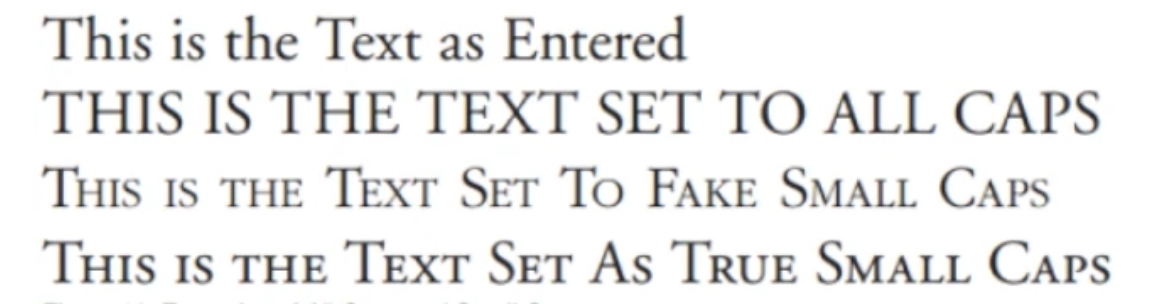
- Small caps & all caps - Small capitals are good for subheadings or for the first line of a paragraph. Text set in all caps should be used in short headlines. All caps should never be used for long sentences and for emphasis.
 |
| Fig 3.5 Small & all caps |
- Special purpose style - Some formatting styles exist within the software for making footnotes or references, these tend to be embedded within the tools sections and a lay user may not be aware of their functions.
 |
| Fig 3.6 Special purpose style |
- Text scaling - This will distort the original design of the font and makes the messaging appear cheap. NEVER do this.
 |
| Fig 3.7 Text scalling |
- Outline and shadow - Another style that tends to be abused a lot. This takes many years of practice and experience to use effectively and beautifully. Avoid outline and shadow as far as possible.
 |
| Fig 3.8 Outline & shadow |
- Type size, line length & line spacing - Text that flows naturally when read is achieved by having a harmonious relationship between the type size, line length and line spacing. A column type is usually about 50 characters and not more than 65. A type that is too small will cram together making it harder for the readers to read.
- Line spacing refers to the amount of space between lines of type. Some fonts require more line spacing than others to keep their ascenders and descenders from touching.
- Line length - Longer lines require more leading for easier reading.
- Type size - The larger the type size, the more line spacing it requires.
 |
| Fig 3.9 Type size |
- Overly long or short lines of a type also tire the reader and destroy a pleasant reading rhythm.
- Character and word space - Larger type sizes need adjustments to the space between characters and paragraphs needs to be adjusted.
- Kerning - Inter-character spacing (known as kerning) created a more pleasant-looking text.
 |
| Fig 3.10 Kerning |
- Word space - factors that determine correct word spacing included the typeface which is chosen and the size and weight of the type. Consistency in word spacing can provide an even typographic colour - a term used to refer to the overall lightness or darkness of the text.
 |
| Fig 3.11 Word space |
Legibility / Alignment
- Text alignment can be done in 5 different ways.
- Flush left, ragged right - even letter and word spacing
- Flush right, ragged left - alignments worked against the reader making it difficult for them to find a new line.
- Centred alignments - give the text a very formal appearance and are fine when used minimally.
- Justification (left / right ) - readable if the spacing between words is consistent.
Legibility / Paragraph Spacing
 |
| Fig 3.12 Paragraph spacing |
Automatic space between each paragraph that is applied when starting a new paragraph. Once set it can be applied either above or below the paragraph. It is more elegant to use paragraph spacing rather than simply double spacing returns.
Legibility / Paragraph Indent
Most comment indent is the small indent at the beginning of each paragraph.
- First-line paragraph indents - should only be used if there is no paragraph space as the indents and paragraph space exist to inform the reader when a paragraph stops. Using both indent and paragraph space is overkill. The standard amount of indent is equal to the type size.
- Widow - Single line of text at the top of the page or column.
- Orphan - Single line of text at the bottom of the page or column.
Special formatting
 |
| Fig 3.13 Special formatting |
- Hyphens are usually only used to divide words or numbers.
- En-dash are slightly longer than hyphens used to separate ranges of items such as dates, quantities and time
- Em-dash is used in place of a comma to set off a section. It does have other use such as preceding the attribution of a quote.
Line break - Lines need to be broken for readability. Typing 'return/enter' to break the line can alter formatting when the intention is to break the line. To avoid this problem we can use 'shift-return/enter' rather than the normal return/enter.
Drop caps - Used to start off a new chapter and special sections of a report. There is no need to use this unless we want the text to be decorative.
 |
| Fig 3.14 Drop caps |
Quotation
 |
| Fig 3.15 Quotation |
Sidebar - Text that accompanies the main body copy, usually an added description that has some relation to the main narrative but isn't important enough to be part of it. A good practice is to maintain a leading that is similar to the main body text despite the smaller font size.
Character styles - Formatting controls that are specific to the character font.
♡ 20.09.2022 Week 04
Lecture 4 - The Grid
- The grid is just 1 aspect of many different systems but it is the most practical of them all.
Raster Systeme
- Using the grid as an ordering system is the expression of a certain mental attitude (of a designer)
- It shows that the designer is constructive. The designer's work should also have a clear, intelligible, objective, functional and aesthetic quality of mathematical thinking.
- The grid divides a 2D or 3D plane into smaller compartments. The field of compartments may be of the same or different sizes.
 |
| Fig 4.1 Raster systeme |
- The purpose of the grid - is to solve visual problems in 2D or 3D. By arranging the surface and spaces in the form of a grid, the designer places the information in a coherent and functional matter. This will create a sense of compact planning, intelligibility and clarity. It also suggests orderliness in design. Information that is presented clearly will be read more quickly and understood easily by the reader.
 |
| Fig 4.2 Grid system example |
- Modular - is modular in nature. There is a certain limit when using in a book to maintain continuity and coherence in the outlook or navigation. Having fewer variations may create predictability and readers may get bored after some time.
- Readability and legibility - The grid makes the user experience seamless. It helps us read and understand easily. A well-executed design is one that works subtly in the background and allows the work on the pages to do the talking clearly, logically and elegantly.
♡ 27.09.2022 Week 05
Lecture 5 - Elements
Major elements that are used in publication designs are Type, Colour and Image. Holding these 3 elements together are the format and grid.
Major elements that are used in publication designs are Type, Colour and Image. Holding these 3 elements together are the format and grid.
Variations
- When using the 3 elements (mentioned above) on a page within a grid system, it is important not to be predictable. We must try to create variations within the layout while maintaining consistency across the book at the same time.
- To reduce stress, use thumbnail sketches to plan out based on the grid system that we have constructed. After which we can select one good typeface family that has a good range. It is okay if we want to introduce a second typeface later on. (Good typeface family might have a good heading within the type family). We can also use a single typeface to show consistency.
- Hang line, typeface, colour, and image style must be fixed.
Body text + 1 graphic
 |
| Fig 5.1 Body text + 1 graphic |
The colour here is considered a graphical form but if the colour is used on a full page then it is considered a colour. Positioning it in this manner = creating a variation.
Visual element + pullquote or subtext
 |
| Fig 5.2 Visual element + pullquote or subtext |
A larger picture with a caption could pullquote or subtext. Pull-quote is extracted from a larger body text and it enlarges because of its importance. Pull-quotes are sometimes enhanced by using visual imagery in the background (as shown in Fig0.0).
Body text + body text
 |
| Fig 5.3 Body text + body text |
Full page graphic + body text
 |
| Fig 5.4 Full page graphic + body text |
- The sequence or the different formulas that function in a modular nature within the grid system depends on the number of pages within a book.
- Colour plays a role in book design as it can be the focus of attention or a subtle supportive shape to create variation when there is a large amount of text. Elements are positioned logically and in a compositionally attractive manner if the grid used is in a modular way.
- The elements in our book will fall into place when we begin to see the varied formulas possible within the grid system created. Every spread must be divisible by 4.
- Not every spread must be different in a 32-page book. We are expected to rotate and reuse the formulas in our own book design.
INSTRUCTIONS
<iframe src="https://drive.google.com/file/d/1IV7SJ8_0DMXpjWSQn4huyxFxMl2dP5Nj/preview" width="640" height="480" allow="autoplay"></iframe>
TASK 1: EXERCISES
#1 Text formatting
#2 Mock-up making
#3 Signature folding systems
#4 Classical grid structure
#5 Determining grids
#6 Form & movement exercise (thumbnails)
- 1 colour
- 2 colour
- 2 colours + image
- Colours + image + text
#1: TEXT FORMATTING ( 30 - 31/08/2022 ) :
♡ Generate content for our book and it should be 3000 words. The write-up should at least have 3 chapters, 1 pull quote per chapter and 1 subtext.
♡ The content of our book can be written by ourselves or retrieved from the internet.
♡ Hours spent: 1 day including the writing of my story.
<iframe src="https://drive.google.com/file/d/14PYMHa7a805gWQOroDJk6qCiLJUnvfsY/preview" width="640" height="480" allow="autoplay"></iframe>
Fig 6.0 Text formatting pdf
#2: MOCK-UP MAKING ( 06/09/2022 ) :
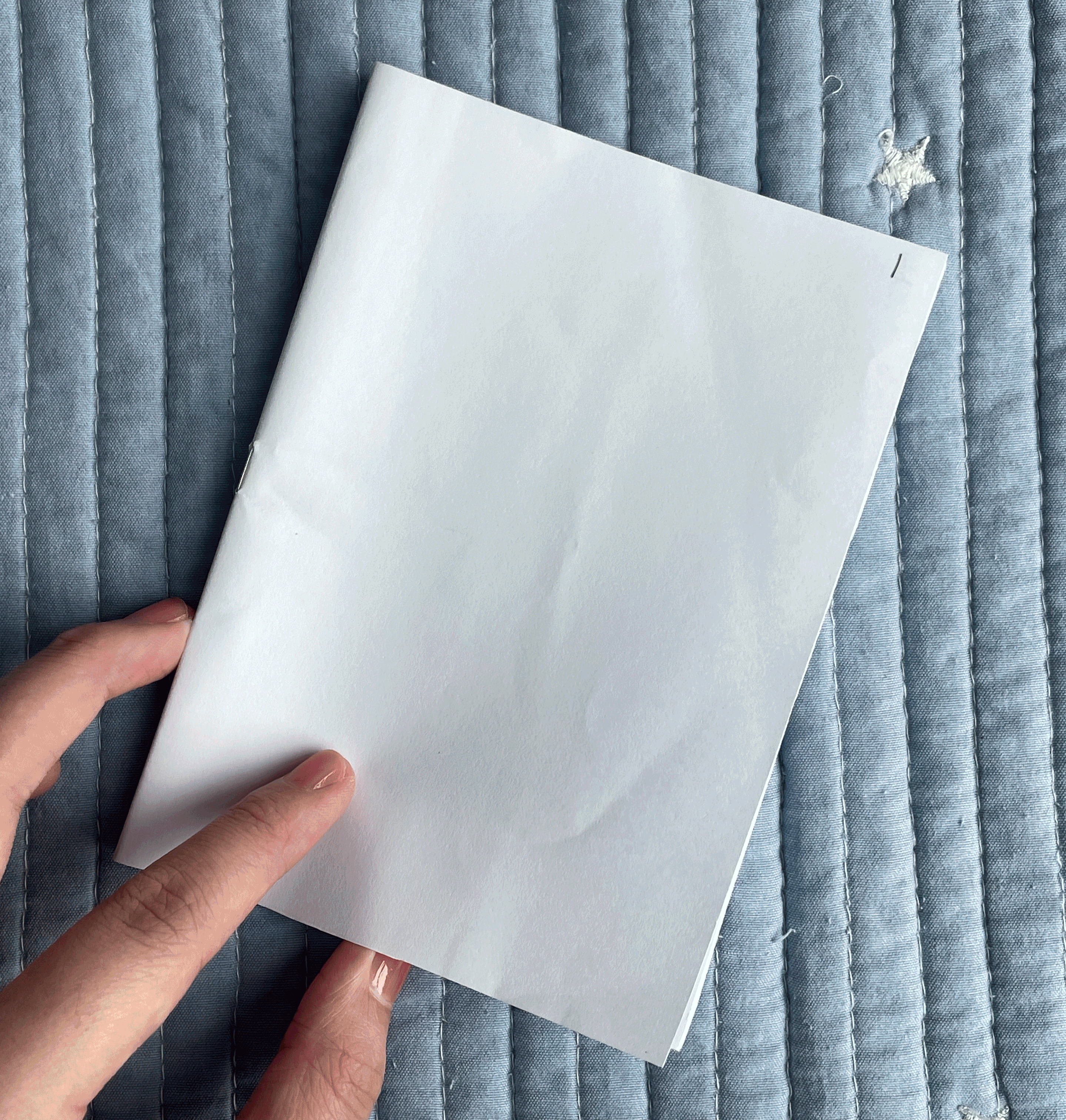
♡ We were told to bring our supplies to class on Tuesday (06/09) and complete exercises 1 - 3 in class. (A4 or A3 paper, adhesive, cutter, pencil, one coloured marker, 16" ruler and stapler)
 |
| Fig 6.1 Supplies prepared |
 | |
|
- 270 x 170mm
- 250 x 200mm
- 240 x 185mm
 |
| Fig 6.3 Size exploration |
Following Mr Vinod's instruction, we can cut out our preferred size and see if we like it or not so that's what I did. Initially, the size I chose was 240 x 185mm but after cutting it out, I didn't like the ratio so I tried another new measurement which is 230 x 170mm (FINAL SIZE).
 |
| Fig 6.4 Size comparison |
 |
| Fig 6.5 Final size open book |
 |
| Fig 6.6 Final size stapler binding |
This was a careless mistake of mine but while I was cutting the pages, I accidentally sliced my finger with the knife cutter :<
 |
| Fig 6.7 Accidents happen :') |
 |
| Fig 6.8 Final size flip through gif |
SIGNATURE FOLDING SYSTEMS ( 06/09/2022 ) :
♡ This exercise is about how book pages are formatted for printing. The first step is to fold a paper 3 times. Similar to the exercise above, I used a sheet of A3 paper for this task.
 |
| Fig 7.1 Folding and numbering |
♡ After folding the paper, we then had to add numbers to each fold.
 |
| Fig 7.2 Opened signature |
 |
| Fig 7.3 Signature stapler binding |
 |
| Fig 7.4 Signature flip through gif |
#4: CLASSICAL GRID STRUCTURE ( 06/09/2022 ) :
♡ Van de Graff ( 1 hand drawn, 1 digital )
 |
| Fig 8.1 Hand-drawn Van de Graff |
<iframe src="https://drive.google.com/file/d/1O52-UCwB15aF1DCc2JbqJditpt7KnqgA/preview" width="640" height="480" allow="autoplay"></iframe>
Fig 8.2 Digital Van de Graff
#5: DETERMINING GRIDS ( 13/09/2022 ) :
♡ This task was done in week 3's online class. We were first asked to find a unique or nice-looking magazine layout. After finding a magazine layout that we like, we were asked to upload it into Indesign and determine the grids of the layout.
 |
| Fig 9.1 Week 3 - online class |
 |
| Fig 9.2 Determining grids with reference picture |
♡ After finishing the task above, we were asked to come out with 3 different types of our own grid system. I decided to use the story I wrote for the content generation for this exercise.
 |
| Fig 9.3 Grid system #1 |
 |
| Fig 9.4 Grid system #2 |
 |
| Fig 9.5 Grid system #3 |
♡ Moving on, I didn't really like the grids above so I went ahead and created a new one just to see what I could come up with and finally I was really happy with this outcome so I decided to go fot it!
 |
| Fig 9.6 Grid system #4 (CHOSEN ONE) |
#6: FORM & MOVEMENT ( 20/09/2022 )
♡ This exercise was done in class and we are to refer to the tutorial video Mr Vinod provided.
♡ We were asked to do the black and white version first.
 |
| Fig 10.1 Form & movement bnw attempt 1 |
♡ After the feedback, I decided to try again with the form and movement at home. I only redid the part that needed changing.
 |
| Fig 10.2 Form & movement bnw attempt 2 |
♡ When we were trying to export the thumbnails in class, for some reason I wasn't able to. Even following the tutorial video Mr Vinod provided did not work. It was weird since I have my printer connected to my laptop and the printer drive so after the class, I went back home and tried to figure this issue out. To my surprise, I actually found a way to export the thumbnails.
♡ I found out that instead of exporting it as a pdf, I could export it as a postscript file. After exporting, I'm able to open the postscript file and it will automatically be converted to a pdf.
 |
| Fig 10.3 Exporting thumbnails |
#6: FORM & MOVEMENT ( 20/09/2022 )
♡ Coloured version, colour ratio 70/30
 |
| Fig 10.4 Form & movement coloured version |
 |
| Fig 10.5 Form & movement image version |
 |
| Fig 10.6 Form & movement image + text version |
FEEDBACKS
Week 02 - 06/09/2022
General Feedback:
- Don't forget to add references at the end of the document
- Introduction needs to be longer than 1 paragraph
- There are multiple types of copyright so make sure we use/write the correct one.
- look at visual references, and identify the ones we feel fit to
- please do not be literal with the way we explain the sentence (be metaphorical, etc) think more broad and abstract
- visuals are the most important part of the book, important that the cover has an impact
- cover can be part of the 16 illustrations
- start sketching after visual references (show a few attempts of visual making on week 3)
DO NOT create fixed borders, let it flow
Lecturer Feedback:
- Remove the brackets in the copyright section.
- 'Sdn Bhd' can be capital or small letters depending on how I write the publication company's name.
- Mr Vinod also mentioned that generally when there's a title the first letter of each word will be capitalised.
- For subtext, Mr Vinod mentioned that it was a good idea for me to number them in the text.
- Above all, remember to include a reference list at the end.
Week 03 - 13/09/2022
General Feedback:
- Text formatting should appear in both task 1 and task 2 (blog)
- Update portfolio task 1 & 2
Lecturer Feedback:
- Knife illustration is good but instead of blood maybe could reserve it for one knife or make one of the knives look like it's breaking and the others will look the same.
- Reconcile the styles, bring them together
- Be careful of the line thickness, try to maintain a consistent line thickness
- Work out a colour palette so that I don't stray away by using the different colour palettes, can extract the colours from visual reference if I like the colours
- Neutral shades are very important too.
- Could be more experimental instead of typical illustrations of whole things/scenarios
Week 04 - 20/09/2022
General Feedback:
- (form and movement ex) the forms needs to transition/flow nicely without it being too obvious
- Avoid having too fast of jumps in between the forms
- Avoid having too fast of jumps in between the forms
- For colour form and movement, 70-30 ratio, colours must be placed strategically and minimally
Lecturer Feedback:
- (Form and movement ex) Nice forms but it just needs a little more work to it
- The first row and last row is fine, they transition nicely but the second row needs more work to it as the flow and movement does not make sense
- The first row and last row is fine, they transition nicely but the second row needs more work to it as the flow and movement does not make sense
REFLECTIONS :
Experience -
Overall I found this task interesting as it showed us how book publications are actually done. It was also quite fun to be able to actually fold and cut out the desired book size that we wanted! Except the not so fun part was me slicing my own hand. The thing I dreaded the most was the determinng grids task. I struggled a little with finding the one I wanted but thankfully I managed to figure it out. I realised that my page margins was the issue and by adjusting them my page really did not look as messy as it did before. Oh and I also actually caught a nasty cold and wasn't feeling well for a week but I PULLED THROUGH and still managed to get everything done in time. :')
Observations -
I observed that although a grid system may look simple but actually there are many ways to make it look interesting. It also requires much thought to make a grid system look nice and consistent while also making the informations flow smoothly. I observed that it is not necessary to make the whole page look
full by having texts all over it as it could look very crowded and messy. Instead, by leaving a few blank spaces could really make the layout nicer and neater.
Findings -
Creating a good layout system may seem harder than we think it is. It requires much time and effort to be able to come up with a layout that has both consistency and fluency. I also found the signature system to be quite interesting since I never knew that is how books are printed on.
FURTHER READING:

An article by Mr Vinod himself! It was quite interesting to read on how the form & movement task we're doing in this exercise came about. The earliest form of this task was to draw out each grid + colour the grids. Though it could be very time consuming, it looked very exciting based on the images provided! It was interesting too see many different layouts too.
Things to note:
- Layouts that are interesting and can surprise readers with every turn of the page must also have a good transition to it. Transitions must look 'seamless'.
- It is important that our placement of information can create cohesion and a healthy level of variation.
- Forms have to flow in a manner to create a subtle narrative through movement. Forms can be texts, colours, visuals or white space.


Comments
Post a Comment